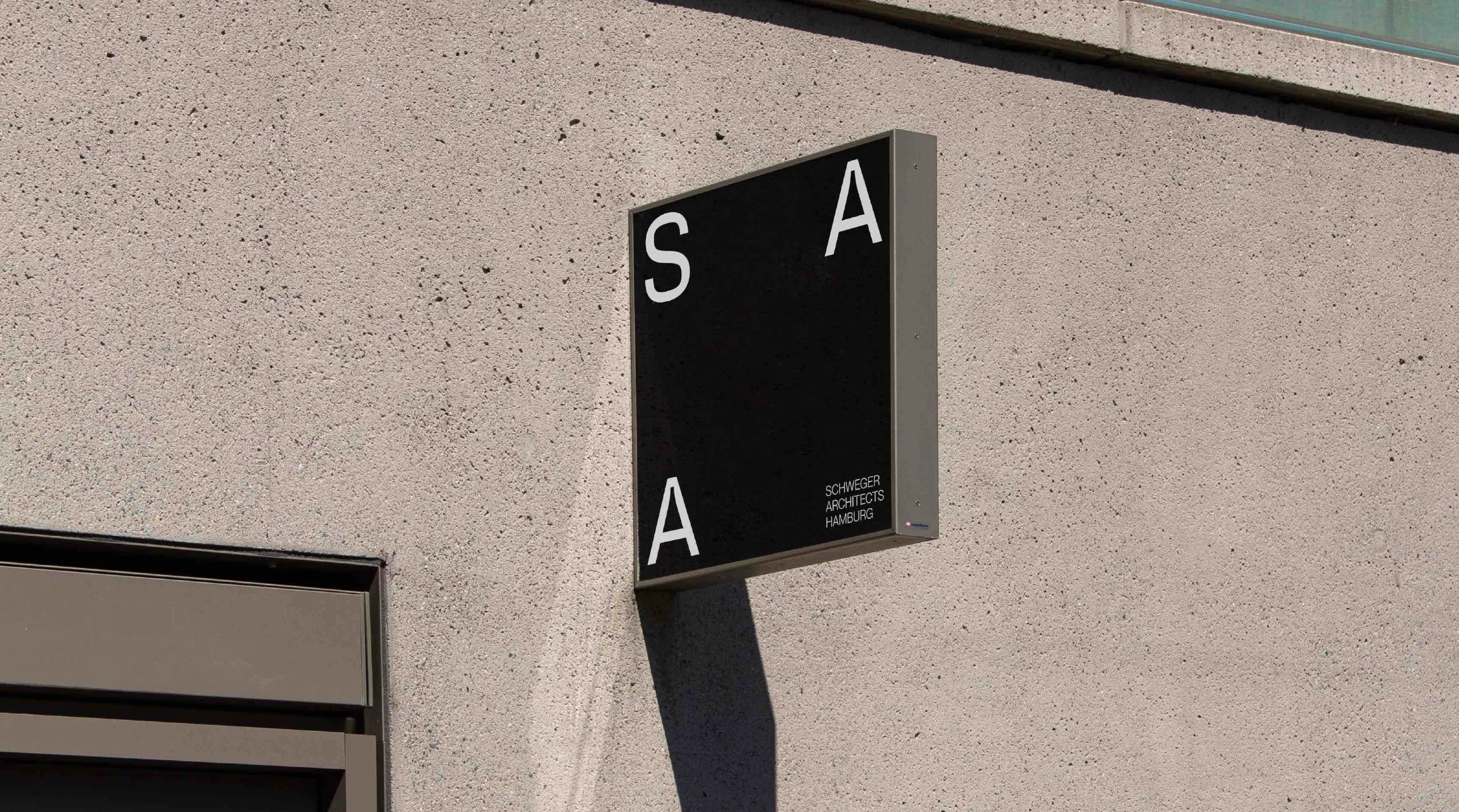
A constructed but also adaptable system which could get expanded with the first three letters from new locations of offices. The logo represents the long existing, classical, well-trusted and known office, but now with a young and open approach focussing on being adaptable towards new ideas and projects with upcoming clients.
Client
SAA Schweger Architekten
Result
Logo
Creative Discipline
Graphic Design
Year
2022
Collaborators


No items found.